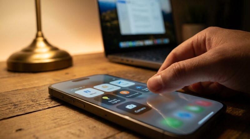
Stop Letting Swipes Waste Your Time: The Hidden ‘Control Center Pages’ Layout Trick iPhone Power Users Use To Reach Any Toggle In One Flick
You swipe into Control Center for one quick thing, then get stuck staring at a crowded patchwork of icons. It is annoying because the controls you actually use, like Focus, Personal Hotspot, Low Power Mode, or your front door camera, somehow end up buried under the stuff you touch once a month. If that sounds familiar, the good news is you do not need a new app or a deep settings hunt. The real trick in the iOS 18 control center hidden features pages layout is treating Control Center like a set of pages, not one giant panel. Once you stack pages by purpose, resize the tiles that matter, and add a few smart actions, you can get to almost any toggle in one flick instead of poking around every time. It is one of those small iPhone changes that saves a surprising amount of time because you use it dozens of times a day.
⚡ In a Hurry? Key Takeaways
- Yes, iOS 18 lets you build multiple Control Center pages so your most-used controls are not trapped in one cluttered screen.
- Make one main page for daily basics, then create extra pages for connectivity, smart home, and battery or privacy tools.
- This setup is safe and built into iPhone. It can also work with Shortcuts, Focus modes, and the Action button for faster access with fewer taps.
The hidden trick is simple. Stop thinking of Control Center as one page.
Most people customize a few icons and call it a day. That helps a little, but it does not fix the real problem. Everything still lives in one crowded space.
In iOS 18, the better move is to split your controls into pages. Think of them like mini dashboards. One for everyday stuff. One for travel and connectivity. One for smart home. One for battery and privacy.
That way, a quick swipe gets you into Control Center, and one more flick lands you on the exact category you need. No more scanning every tiny button like you are looking for a lost sock.
How to set up Control Center pages in iOS 18
Step 1: Open Control Center and enter edit mode
Swipe down from the top-right corner of your iPhone. Then press and hold in an empty area, or use the add and customize controls option if it appears on your version of iOS 18.
You should see the layout loosen up so you can move, resize, add, or remove controls.
Step 2: Build your first page around what you use every day
Your first page should be boring in the best way. Put only the things you reach for constantly.
Good picks for a main page include:
- Brightness
- Volume
- Focus
- Wi-Fi or connectivity tools
- Flashlight
- Now Playing
- Low Power Mode
Resize the most important ones so they are easier to hit. If Focus is something you use all day, make it larger. If Screen Recording is rare, keep it small or move it elsewhere.
Step 3: Add extra pages by theme
This is where the power-user part starts. Instead of stuffing everything into page one, create a few purpose-based pages.
Try a layout like this:
- Page 1: Daily. Brightness, volume, Focus, music, flashlight.
- Page 2: Travel and connectivity. Personal Hotspot, AirDrop, cellular data, VPN shortcut, airplane mode.
- Page 3: Home. Favorite lights, locks, cameras, thermostat scenes.
- Page 4: Battery and privacy. Low Power Mode, dark mode, screen recording, hearing access, microphone or related tools.
Now each swipe has a purpose.
Why resizing tiles matters more than people think
Tiny buttons are fine until you are in a hurry, outside in the sun, or half awake in bed. Resizing fixes a lot of friction.
Make larger tiles for controls that need quick access or more precise tapping. Focus is a great example. So is Personal Hotspot if you tether often. Smart home scenes also work better when they are bigger and easier to spot.
Small controls are still useful for things you rarely need but want nearby.
If you want more ideas on turning the layout into something practical, Stop Digging Through Settings: The Hidden iOS 18 Control Center Stacks Power Users Turn Into One‑Swipe Dashboards is a helpful companion because it focuses on the stack-and-sort approach that saves the most time.
The best page layouts for real life
For commuters
Build a connectivity page with Bluetooth, AirDrop, Personal Hotspot, Maps-related shortcuts, and a Focus mode like Driving.
If your day involves trains, coffee shops, and patchy signals, this page becomes your quick fix panel.
For parents
Create a page with Home controls, flashlight, Low Power Mode, white noise shortcut, and camera access. Bigger tiles help when you are doing three things at once.
For work
Use one page for Work Focus, calculator, notes shortcut, screen recording, and maybe a shortcut that opens your time-tracking app or starts a meeting routine.
For smart home fans
Make a dedicated home page with the controls you actually use, not every device in the house. Front door lock. Hall lights. Nursery camera. Goodnight scene. Keep it tight.
Tie Control Center to Shortcuts for one-tap tasks
This is the part many people miss. Some Control Center controls can connect to Shortcuts, which means a button can do more than flip a simple switch.
For example, you can create a Shortcut that:
- Turns on Low Power Mode and reduces brightness
- Starts a work Focus and opens Slack or Mail
- Sets a sleep scene with lights off and alarms ready
- Turns on Personal Hotspot and opens your laptop-friendly notes app
Once added to Control Center, that shortcut becomes one tap instead of five or six separate actions.
How Focus modes and the Action button make this even better
Control Center gets much more useful when it matches your day. Focus modes help with that. If you regularly switch between Personal, Work, Sleep, and Driving, put Focus in a prime spot on page one.
If your iPhone has an Action button, you can also use that as a companion. For instance, let the Action button trigger your main shortcut, while Control Center pages handle the rest of your quick controls.
That gives you two fast lanes. One physical button for your top action. One swipe-based dashboard for everything else.
Common mistakes that make Control Center feel messy again
Trying to keep every control visible
You do not need every possible toggle front and center. If you never use Wallet from Control Center, move it out. If Magnifier is once-a-year stuff, it does not deserve premium space.
No page logic
If page two has a flashlight, thermostat, calculator, and airplane mode all mixed together, you will still waste time. Group by context, not by randomness.
Ignoring tile size
Tile size is not cosmetic. It changes how fast you can spot and hit a control.
Never revisiting the setup
Your habits change. Travel season, school season, a new smart lock, more battery anxiety. Adjust your pages every few months.
Who benefits most from this?
Honestly, almost everyone. But it is especially useful if you:
- use Focus modes often
- rely on Personal Hotspot
- have smart home gear
- keep opening Settings for the same toggles
- feel overwhelmed by constant iPhone changes
This is one of the cleaner iOS 18 control center hidden features pages layout upgrades because it makes the phone feel calmer, not busier.
At a Glance: Comparison
| Feature/Aspect | Details | Verdict |
|---|---|---|
| Single crowded page | All toggles compete for space, which makes common controls harder to find fast. | Fine for light users, frustrating for everyone else. |
| Multi-page layout | Pages sorted by purpose, such as daily use, travel, home, or battery and privacy. | Best setup for speed and less visual clutter. |
| Shortcuts, Focus, and Action button tie-ins | Turns Control Center into a command hub for routines, modes, and one-tap tasks. | Most useful for power users, but easy enough for regular users to start with one shortcut. |
Conclusion
If Control Center still feels like a junk drawer, the fix is not learning more icons. It is giving those icons a better home. iOS 18’s redesign gets the attention for its flashy look, but the real win is the power-user angle. Stack multiple pages, resize the tiles you actually care about, and connect the setup to Shortcuts, Focus, and the Action button where it makes sense. The result is less tapping through Settings, faster access to privacy and battery tools, and a phone that feels more predictable at a time when every update seems to add one more thing to think about. Start with one clean main page and one extra page for your most common need. You will feel the difference almost immediately.