Stop Digging Through Settings: The Hidden iOS 18 Control Center Stacks Power Users Turn Into One‑Swipe Dashboards
You swipe down for one quick toggle, then spend the next 10 seconds hunting for it like you are digging through a kitchen junk drawer. We have all been there. Control Center used to be simple. Now it can hold flashlight, timers, Focus modes, smart home scenes, Wallet, screen recording, music controls, camera shortcuts, hearing tools, and a pile of app controls. Useful, yes. Neat, not always. The good news is that iOS 18 finally gives you a better way to organize the mess. You can build multiple Control Center pages, resize buttons so the stuff you use most is easier to hit, and create grouped stacks that expand only when you need them. Once you set it up properly, Control Center stops being a random pile of switches and starts feeling like a one-swipe dashboard built around your day. That means fewer taps, less frustration, and much faster access to the things you actually use.
⚡ In a Hurry? Key Takeaways
- In iOS 18, you can customize Control Center with multiple pages, larger or smaller tiles, and expandable stacks for related controls.
- Start by building pages around situations, like work, commuting, home, or content creation, instead of cramming everything onto one screen.
- You are not deleting features by experimenting. You can always remove controls, rearrange them, or reset your layout if it gets messy.
Why Control Center feels messy now
Apple kept adding more tools to Control Center, which is great in theory. The problem is most people still treat it like a single flat list of buttons.
That worked years ago when the choices were basic. It does not work nearly as well once you add Home controls, Focus modes, accessibility tools, camera options, app shortcuts, and media controls.
The fix is not to remove everything. The fix is to organize it by job.
How to customize iOS 18 Control Center pages and stacks
If you want the short version, open Control Center, then long-press on an empty area to enter edit mode. From there, you can add controls, drag them around, resize many of them, and place them on separate pages. Some controls can also be grouped into expandable stacks, which lets you keep related tools together without filling the whole screen.
The exact button labels can vary a bit depending on your iPhone model and iOS version, but the basic process is the same.
Step 1: Enter edit mode
Swipe down from the top-right corner of your iPhone screen to open Control Center. Then press and hold on a blank area until the layout starts to become editable.
You should see options to add controls and move things around.
Step 2: Add new controls
Tap the add option and scroll through the available controls. This is where many people are surprised. Apple now includes far more than the old basics.
You may see controls for:
- Timer and alarms
- Camera and screen recording
- Notes and Voice Memos
- Focus modes
- Wallet
- Shazam or music recognition
- Home app scenes and accessories
- Accessibility tools
- Third-party app controls, if supported
Step 3: Resize what matters most
This is one of the biggest improvements. If there is a control you hit all the time, make it bigger. If something is useful but occasional, shrink it down.
Think of it like arranging apps on your kitchen counter. Coffee maker gets prime space. The waffle iron does not.
Bigger tiles are easier to spot and tap quickly. That alone makes Control Center feel calmer.
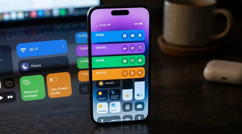
Step 4: Create separate pages
Instead of forcing everything onto one sheet, split controls into pages based on how you live.
For example:
- Main page: Brightness, volume, Wi-Fi, Bluetooth, flashlight, camera
- Work page: Focus, timer, voice memo, low power mode, calculator
- Travel page: Wallet, maps-related shortcuts, music recognition, battery controls
- Home page: Lights, locks, thermostat, garage, favorite scenes
This is the part that really changes the experience. Instead of one crowded panel, you get mini dashboards.
Step 5: Use stacks for related controls
Stacks are the secret sauce. A stack is basically a grouped set of controls that expands when needed.
That means you can keep related actions together without letting them take over the whole layout.
Good stack ideas include:
- Meeting stack: Do Not Disturb, timer, notes, voice memo
- Media stack: Shazam, playback controls, hearing tools, screen recording
- Home stack: front door lock, lamp scene, thermostat, fan
- Travel stack: Wallet, low power mode, flashlight, cellular toggles
The best way to build pages that actually help
The trick is to stop organizing by category and start organizing by moment.
Most people do not think, “I need a connectivity control.” They think, “I am getting in the car,” or “I am about to join a meeting.” Build around that.
Dashboard idea: Work and meetings
If your day is full of calls, this page can save you a lot of tiny annoyances.
- Focus mode
- Timer
- Voice Memos
- Notes
- Screen Recording
- Brightness
- Mute-related audio controls if available
This setup is great if you bounce between Zoom, Teams, Meet, and phone calls. You can switch into work mode with one swipe.
Dashboard idea: Commuting and errands
This page is all about speed.
- Wallet
- Low Power Mode
- Flashlight
- Music recognition
- Maps or location-related app controls if supported
- Focus mode for driving
If you use transit cards, event tickets, or payment passes often, putting Wallet on a dedicated page is a small change that feels surprisingly good every day.
Dashboard idea: Content creation
If you make videos, record clips for social media, or grab a lot of screenshots, this one is a winner.
- Camera
- Screen Recording
- Voice Memos
- Notes
- Shazam
- Brightness and volume
It cuts down on the “where was that setting again?” problem when you are trying to capture something quickly.
Dashboard idea: Smart home control
This is where Control Center starts feeling genuinely futuristic, not in a cheesy way, just in a useful one.
- Favorite Home scenes
- Door lock
- Garage door
- Thermostat
- Lights
- Fan or air purifier
If your home setup is bigger, use stacks here. Keep security controls together, lighting together, and comfort controls together.
Dashboard idea: Gaming and downtime
For evening use, build a page around not being interrupted.
- Gaming Focus
- Brightness
- Volume
- Low Power Mode
- Screen Recording
- Music controls
It is simple, but it keeps you from bouncing through Settings while a game or stream is open.
Third-party controls are worth checking
This is another place where Control Center has quietly grown up. Some apps now offer their own controls, which means your favorite tools may be able to live there too.
Not every app supports this, and support varies. Still, it is worth looking through the add-controls list every so often. You may find shortcuts you did not know existed.
If you use task apps, note apps, media apps, or home apps from outside Apple, this can make your layout much more useful.
What to remove first
If your Control Center feels overwhelming, start by cutting the controls you rarely touch.
Good candidates for removal or shrinking:
- Buttons you added once and forgot about
- Duplicate ways to do the same thing
- Controls that are easier to access somewhere else
- Large tiles for features you only use once a month
The goal is not to build the most powerful Control Center. It is to build the one that gets out of your way.
A simple layout that works for most people
If you do not want to overthink it, try this three-page setup.
Page 1: Everyday essentials
- Wi-Fi
- Bluetooth
- Brightness
- Volume
- Flashlight
- Camera
Page 2: Focus and productivity
- Focus modes
- Timer
- Notes
- Voice Memos
- Low Power Mode
Page 3: Home and travel
- Wallet
- Home scenes
- Door lock
- Shazam
- Screen Recording
That setup gives you a cleaner front page and two purpose-built extras. For many people, that is the sweet spot.
Mistakes to avoid
Making every control huge
It sounds nice until you run out of room. Make only the controls you hit constantly larger.
Keeping everything on one page
This is the main reason Control Center feels cluttered. If it looks crowded, split it up.
Organizing by what Apple calls things
Ignore the official categories. Build around your routines instead.
Never updating it
Your habits change. So should your layout. A quick clean-up every few months helps a lot.
Is it safe to experiment?
Yes. You are just changing shortcuts and layout, not doing anything dangerous to the phone.
If a page turns into a mess, you can remove controls and rebuild it. So there is no real downside to trying a few setups and seeing what feels natural.
At a Glance: Comparison
| Feature/Aspect | Details | Verdict |
|---|---|---|
| Multiple pages | Lets you separate everyday tools from work, travel, home, or media controls. | Best upgrade for reducing clutter fast. |
| Resizable tiles | Makes your most-used controls easier to spot and tap while shrinking less important ones. | Great for speed and usability. |
| Stacks | Groups related controls into expandable sections so they stay handy without hogging space. | Most powerful option for power users. |
Conclusion
Control Center quietly became one of the most useful parts of the iPhone, but a lot of people are still using it like it is 2019. That is why it feels crowded and oddly stressful. Once you learn how to customize iOS 18 Control Center pages and stacks, things click into place. You stop digging through random buttons and start swiping into dashboards built for your actual life. Work, commuting, content creation, home control, gaming, whatever matters to you can have its own space. Add a few pages, resize the controls you hit all the time, and group related tools into stacks that open on demand. It is one of those small setup jobs that pays you back every single day. Spend ten minutes on it once, and your iPhone starts feeling a lot smarter.