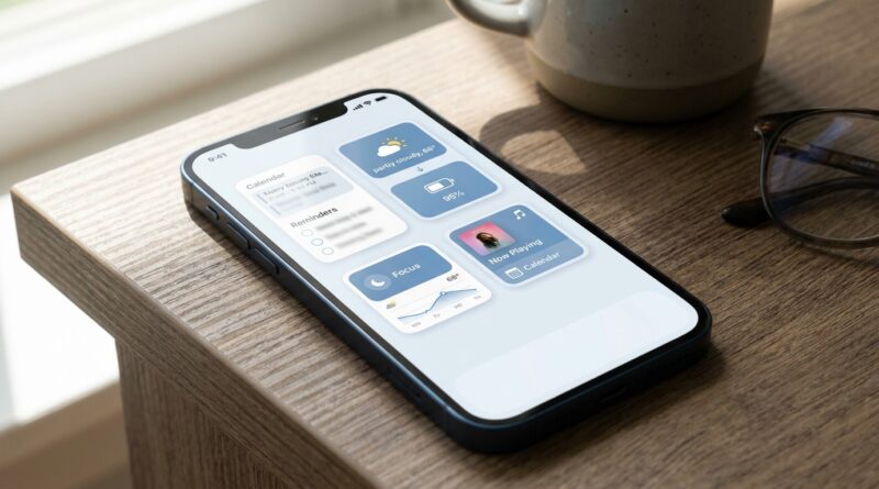
Stop Letting Clutter Slow Every Swipe: The Hidden ‘Stacked Widgets Home Screen’ Trick iPhone Power Users Use To See More With Fewer Screens
Your iPhone Home Screen can turn into a junk drawer without you noticing. One weather widget here, a calendar there, six apps you barely open, then another whole page you keep “just in case.” The result is annoying in a sneaky way. You keep swiping, scanning, and hunting for the same things over and over. It does not feel dramatic, but it chips away at your focus all day long. The good news is you do not need to delete half your phone or learn some complicated productivity system. If you want to know how to use stacked widgets on iPhone home screen layouts more effectively, the trick is simple. Put your most useful widgets in one stack, place it where your thumb naturally lands, and let one spot on your Home Screen change jobs throughout the day. Done right, it feels less like “organizing your phone” and more like finally making it cooperate.
⚡ In a Hurry? Key Takeaways
- Stacked widgets let you keep several widgets in one Home Screen space, so you see more without adding more pages.
- Press and hold a widget, edit the stack, then add the 3 to 6 widgets you actually check every day, like Calendar, Weather, Reminders, Maps, and Battery.
- This is safe and easy to undo. You are not deleting apps or data, just changing how your Home Screen shows information.
What stacked widgets actually do
A stacked widget is exactly what it sounds like. It is a pile of widgets sitting in one spot on your Home Screen. You swipe up or down on the stack to move through them.
That means one square or rectangle can show your next appointment, the weather, your battery levels, your reminders, and travel info, without taking over the whole phone.
Apple also offers Smart Stack, which is the version that tries to guess what you need based on time, location, and activity. Sometimes it is helpful. Sometimes it feels like your phone is making weird assumptions. You can use either approach.
Why this works better than adding more widgets
Most people start with good intentions. They add a few widgets because they want quick information. Then the Home Screen gets crowded. Suddenly the “shortcut” system creates more visual noise than it saves.
A stack fixes that. Instead of five separate widgets spread across two or three pages, you keep them in one place. Less clutter. Less eye movement. Fewer swipes.
That is the real win here. Not just neatness. Less mental drag.
How to use stacked widgets on iPhone home screen
Method 1: Build a stack manually
This is the best option if you want control.
- Press and hold an empty area of your Home Screen until the icons jiggle.
- Tap the + button in the top corner.
- Choose a widget, then pick its size.
- Tap Add Widget.
- Add a second widget of the same size to the Home Screen.
- Drag one widget on top of the other.
That creates a stack. You can keep adding more widgets by dragging them onto the same stack.
The important rule is simple. Widgets must be the same size to stack together.
Method 2: Use Apple’s Smart Stack
If you want the fast route:
- Press and hold an empty part of the Home Screen.
- Tap the + button.
- Scroll until you see Smart Stack.
- Choose a size and add it.
Apple fills it with suggested widgets. You can then edit it to remove the ones you do not care about.
How to edit a widget stack so it is actually useful
This is the part most people skip. It is also the part that makes the biggest difference.
Press and hold the stack, then tap Edit Stack. From there, you can:
- Reorder widgets
- Delete widgets you never use
- Turn Smart Rotate on or off
- Turn Widget Suggestions on or off
If your stack keeps showing things you do not want, turn off Smart Rotate. That gives you a more predictable setup.
If you like your phone to surface different info through the day, leave Smart Rotate on and see how it behaves for a week.
The best widgets to stack for everyday life
You do not need ten widgets. In fact, ten is too many. Start with three to six.
For work
- Calendar
- Reminders
- Notes
- Battery, especially if you use AirPods
For home life
- Weather
- Photos
- Fitness
- Home
For travel and getting around
- Maps
- Weather
- Calendar
- Battery
A good rule is this. If a widget does not save you time at least once a day, it probably should not be in the stack.
A simple Home Screen setup that works for most people
If your phone feels busy, try this:
- Keep one main Home Screen page
- Put one medium widget stack near the top or middle
- Keep your four most-used apps in the dock
- Move everything else to the App Library or a second page
That gives you a clean first screen that acts like a control panel instead of a storage closet.
Where to place the stack for the least friction
Placement matters more than people think. If you use your phone one-handed, put the stack somewhere your thumb can easily reach. If you mainly glance at your phone at a desk, top-center can work well for quick scanning.
The best stack is the one you can read and swipe without shifting your grip.
Common mistakes that make widget stacks annoying
Using too many widgets
If you have to swipe through eight layers to find what you want, you built a tiny filing cabinet, not a shortcut.
Mixing random sizes
Stacks only work with matching widget sizes, so plan that ahead of time.
Leaving in “nice to have” widgets
That news widget you glance at once a week is taking space from something more helpful.
Trusting Smart Rotate too much
Some people love it. Others find it unpredictable. If it keeps surfacing the wrong thing, switch it off.
When Smart Stack is better, and when manual stacks are better
Smart Stack is better if your day changes a lot and you do not mind your iPhone making suggestions.
Manual stacks are better if you want the same small set of information every day, in your order, with no surprises.
For most people, a manual stack is the better first step. Start simple. Then experiment.
Should you still keep multiple Home Screen pages?
Maybe, but fewer is better for most people. One focused page for daily essentials, then one extra page for less urgent apps, is usually enough.
You are not trying to show off every feature your iPhone has. You are trying to get through your day with less friction.
At a Glance: Comparison
| Feature/Aspect | Details | Verdict |
|---|---|---|
| Manual Widget Stack | You choose every widget and the order they appear in. | Best for control and a calmer Home Screen. |
| Smart Stack | Apple rotates widgets based on time, location, and usage. | Best if you like helpful automation and do not mind surprises. |
| Separate Widgets Across Pages | Each widget takes its own space, often across multiple screens. | Easy to set up, but often the most cluttered option. |
Conclusion
If your iPhone has started to feel noisy, bloated, or just harder to use than it should, stacked widgets are one of the simplest fixes hiding in plain sight. You do not need to rebuild everything. Just turn one Home Screen area into a flexible little dashboard for work, life, and travel. That can mean fewer swipes, faster decisions, and less of that low-level irritation that comes from constantly searching for things you use every day. iOS keeps adding features, and yes, it can make the phone feel a bit too complex and corporate at times. But this is one of those rare tools that can make your phone feel personal again. Start with one stack. Keep it tight. If it saves you even a few seconds each time you unlock your phone, you will feel the difference by tonight.